
Elements of an Effective Product Listing Page

In the fast-paced world of e-commerce, a product listing page can make or break your online store’s success. Crafting a product listing page (PLP) that converts visitors into customers is both an art and a science. In this blog post, we’ll explore the essential elements that constitute a good product listing page and provide a guide in designing one.
Pagination and Navigation
In the present-day context, there are already various designs for navigating through a product catalogue. Your choice of pagination style should align with your website’s design, user experience goals, and the volume of products you have. In this section, I’ll be listing down the common design patterns you can consider implementing.
Traditional Numeric Pagination
This style uses numerical links, previous and next buttons to navigate through different pages of products. Users can click on page numbers to jump to a specific page. This one is considered to be a classic and safe choice in terms of pagination.

Infinite Scroll Pagination
A more modern and minimal approach is infinite scrolling. This eliminates traditional pagination altogether. As users scroll down the page, more products load automatically, creating a seamless browsing experience. This ensures minimal user friction when customers are going through your PLP.
However my problem with this one is that its too intrusive. Customers might not find it favorable if the site automatically loads more products. Moreover my primary concern with this one is that it prevents customers from seeing the footer while browsing through the product catalogue.
From a developer’s perspective, this can be also be taxing. If not implemented correctly, the performance of the page might suffer since eventually all products will be loaded.
Load More Button
Similar to infinite scroll, this style initially displays a limited number of products and lets users click a “Load More” button to reveal additional items.
Across the design patterns, this is the one I’m most fond of. In my opinion, this strikes the optimal balance between functional and modern look. By removing the intrusive element from the infinite scrolling, you get the sleek and clean design without the tradeoffs.
Products Per Row
The number of products per row on a product listing page depends on various factors, including your website’s design, the size of product images, and user experience considerations. There is no one-size-fits-all answer, but here are some considerations.
Three to Four Products Per Row
This is a common and safe choice, providing a good balance between displaying multiple products at once and maintaining image size and clarity.
Five as a Maximum
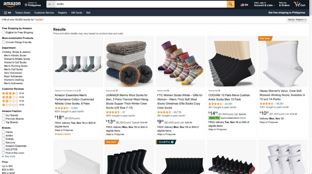
Five product per row is applicable for an ecommerce site with a larger catalogue. When applying this, be mindful of the image clarity and size of the product cards. I also observed Amazon at most displays five in their grid view. I would also NOT recommend going above five.
Two Products Per Row
This style is more spacious and is often used for websites where products have larger images or where an emphasis on each product’s details is crucial. It can provide a clean and uncluttered appearance. Due to the increased spacing, designers usually applies this when they want to incorporate luxury in their branding. Lastly in mobile design, having two products in a row is also the most common choice.
Product Thumbnails
A good product thumbnail on a product listing page is crucial for attracting the attention of potential customers and encouraging them to explore the product further. Product thumbnails should be visually appealing, informative, and optimized for user experience. Heres some considerations when deciding for your product thumbnail.
Clarity and Quality: High-resolution, clear, and well-lit product images are essential. Users should be able to see the product details, textures, and colors clearly. Avoid blurry or pixelated images.
Visual Consistency: Ensure that the style and presentation of the thumbnail images match your website’s overall design and branding. Consistency in color schemes and typography contributes to a cohesive look.
Product Image Background: Use a clean and consistent background that does not distract from the product itself. A white or neutral background is a popular choice, but it can vary depending on your brand’s aesthetic.
Alt Text: Include descriptive alt text for accessibility and SEO. This helps users with visual impairments understand the product, and it can improve your website’s search engine ranking.
Multiple Angles or Views: If possible, provide multiple thumbnail images of the same product from different angles or in various states (e.g., open/closed, front/back). This allows users to get a comprehensive view of the product.
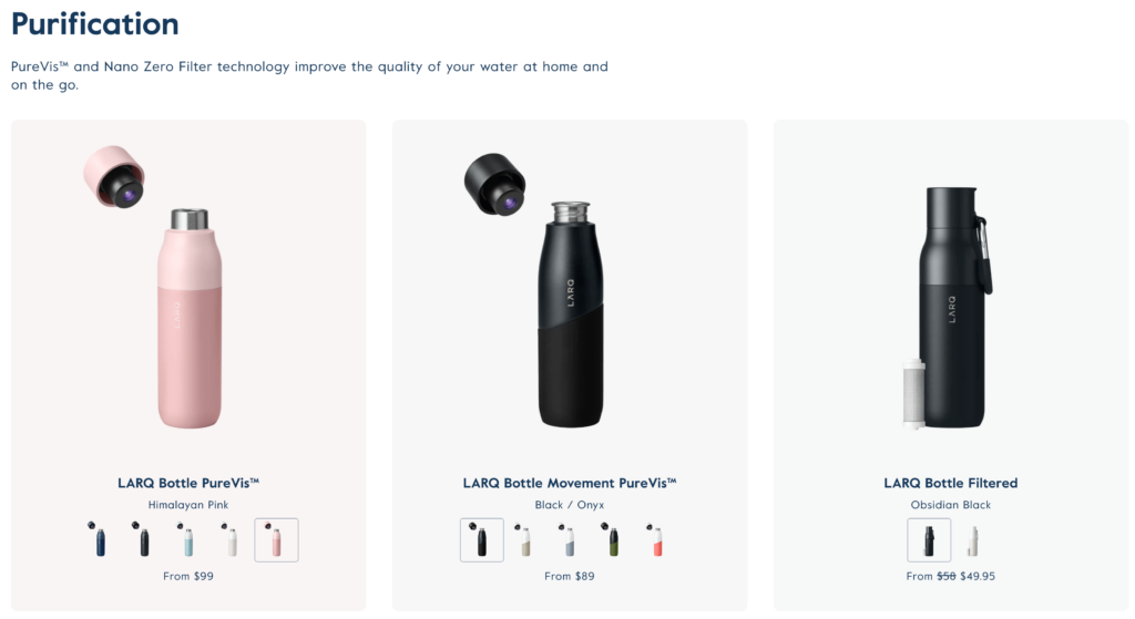
A good illustration for these recommendations is Larq. Although the background varies from product to product it does not distract from the main product. It also has a great design hierarchy. It did an awesome job in highlighting the product title, variant and price.
Call to Actions
In a product card on a product listing page, various call-to-action (CTA) elements are commonly used to encourage user interaction and facilitate the buying process. These CTAs are strategically placed to guide users through the decision-making journey and ultimately lead to conversions. Here are some common CTAs you can include in a product card.
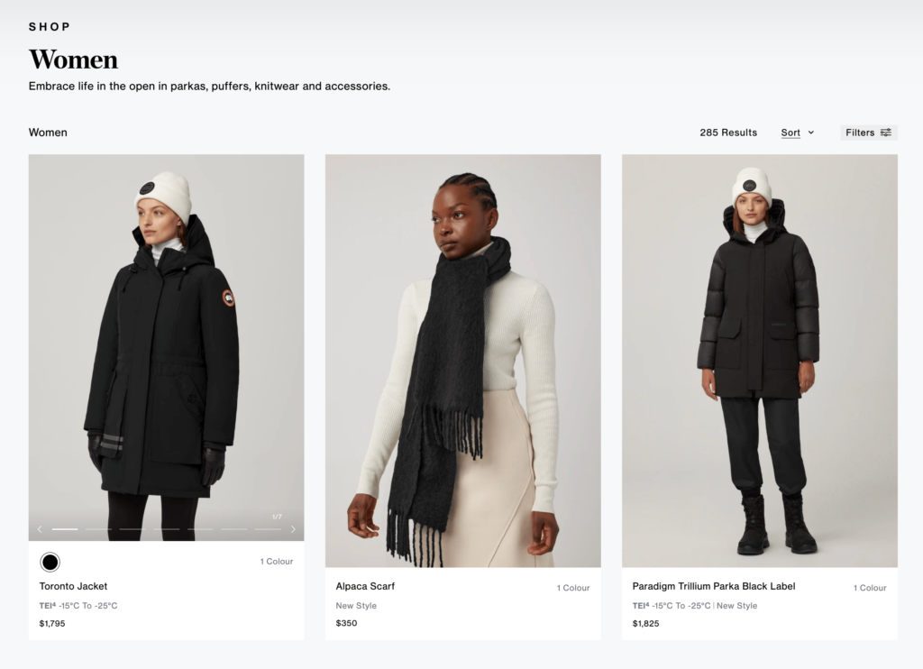
By default, clicking other than the in the product card should navigate the customer to the Product Detail Page (PDP). Product card designs are also a critical factor in listing pages. I would be making a separate blog post about it but for reference this design from CanadaGoose makes a good reference.
Add to Cart
It’s typically the most prominent and important action on a product card. However, this only applies on simplified products where no variants or modifiers are needed to add the product to the card. Otherwise, a quickview can be implemented or a direct approach is to navigate the customer to the product page.
Quickview
In cases where you don’t want the customer to navigate away from the listing page, a modal version of the product detail page can be implemented. Clicking this button will display possible modifiers and variants that the customer can eventually add to the cart.
Add to Wishlist
Enable users to save products for future consideration by adding them to a wishlist. This can be a valuable feature for users who are still deciding.
Should you implement a Quick View
Primarily the decision to implement quick views relies on the complexity of the product. If there are no variations or modifiers, then an add to cart option would be preferable. Another option is to naturally direct the customer to a product detail page.
In my opinion, I am not fond of the quick view approach. This ties with the natural human behavior in relation to immediately closing popups. I recommend implementing an A/B testing to see which works for your audience.
Product Filters
Good product filters play a crucial role in enhancing the user experience on product listing pages. They help users quickly narrow down their product choices based on specific criteria, making it easier for them to find the products they are looking for. This one from Shein displays a basic example of a proper product filter.
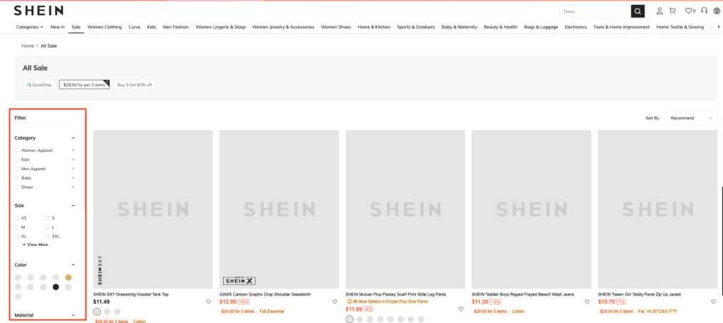
Categorization and Hierarchy: Organize filters hierarchically, with broader categories at the top and more specific options beneath them. This makes it easier for users to refine their search gradually. In terms of web design, consider using a hierarchy tree.
Facets: Filters should be relevant to the products being listed. Consider the unique characteristics of your products and design filters that make sense for your target audience. Depending on your product common facets are color, size and brand.
Clear Reset or Clear All Option: Provide an option to clear all selected filters to allow users to start their search anew. This can save users time and frustration.
Filter Counters: Display the number of products that match each filter option. Users appreciate knowing how many products they can expect to find with a particular filter selection.
Grid vs List View
The choice between grid view and list view for product listing pages in web design depends on several factors, but primarily it heavily relies on product information. Each view has its own advantages and may be more suitable for specific situations.
If you want to prioritize product images, grid view is obvious choice. It’s an excellent choice if your products are visually appealing and benefit from a more visual presentation. Moreover, grid view allows users to quickly scan larger number of products at once, making it suitable for users who prefer a visual browsing experience.
On the other hand, if you want to highlight product information then list view is the optimal choice. It is more information-dense and provides users more key information. If your website’s focus is on content and information, such as reviews, specifications, or technical details, list view may be a more suitable choice.
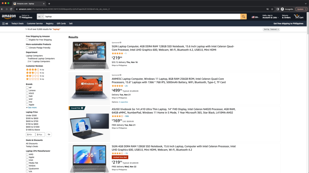
Fun fact: Amazon uses both design patterns. In their search bar, try searching for ‘socks’ and ‘laptop’. Laptop returns a list view while socks returns a grid view. I will assume this has something to do with the length of the product title or the product information they want to display.
Conclusion
Creating an effective product listing page is an ongoing process that requires careful attention to detail, regular updates, and an understanding of your target audience. By incorporating these essential elements, you can create a product listing page that not only attracts visitors but also turns them into loyal customers, contributing to the growth of your online business.